OtterBox Resurgence

otterbox-resurgence-frontiPhones don’t exactly have the best battery life. With normal use, they last me about a day. But with heavy use, which is often, I’d be lucky if they last till the evening. So I considered either a battery case or a power bank to address this limitation. Once, I spotted a Mophie Juice Pack but due to budget considerations I didn’t get it. When I finally decided to, I couldn’t find one anymore. So I settled for a power bank which does work but can sometimes a bit unwieldy and often get left behind. Then last Friday, I was looking at OtterBox cases when I saw the Resurgence. Being an avid OtterBox fan, I immediately got it.

The Resurgence is composed of two pieces. The front piece covers the sides and wraps around the edges giving the screen a slightly raised protective bezel. This protects the screen from direct contact when the phone is face down. The buttons have touch-through covers that are easy to press. Unfortunately, they are a bit loose and rattle when your shake the case. There are ports for the speakers that channel sound to the front. Finally, there are cutouts for the silent switch and the charging button on the back piece. The silent switch is still easily accessible with a finger.
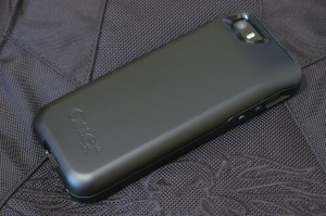
otterbox-resurgence-backThe back piece is a big chunk that holds the battery. There are cutouts for the camera, flash, and silent switch. At the bottom portion, it has an internal Lightning plug, a micro USB port, a through-port for headphones, and the charging button which also acts as a battery level and charging indicator. It is coated with a black smooth material which seems less rubbery and more durable than similar coatings.

To install, you slide the phone inside the back piece and into the Lightning plug. Then you snap the front piece over the phone. The case comes with just a bit of charge from the factory so the first step is to charge using the included micro USB cable. Once charged, you press the charging button to see the battery level. There are four lights arranged around the button which shows the charge level in 25% increments. To charge, you press and hold the button for 3 seconds. To stop charging, you do the same thing.

The whole case fits the iPhone snugly and in fact it is very difficult to remove the phone. It looks quite rugged and could bounce off the floor. In fact, it is military-rated for drop protection (MIL STD 810G-516.6; Do note the Applicability to “ruggedized” consumer products section). So for a rugged battery case, I think it’s pretty good. I like it better than the Mophie Juice Pack though I’m not sure if it’s as rugged as the Mophie Juice Pack Pro.

Now for the bad stuff. The battery, although advertised to give you 2x (as in phone lasts twice as long), so far only get me (starting from below than 10%) to just around 70-80%. Quite frankly, that sucks. I’m hoping a few cycles will result in improvements. Another problem is that the charging button seems to be prone to cracking. Finally, there are quite a few molding imperfections on the casing. They’re small but they’re there. All these is unfortunate as OtterBox has, in the past, been known for quality. It seems the stiff competition is forcing it to cut corners. That’s bad news for both OtterBox and us.

Rating: 3/5
Two iPhones and a Watch

As widely expected, Apple announce the iPhone 6 at their September 9 event. Actually two iPhones. Specifications-wise, they’re actually average. So they’re quite disappointing to some (and always disappointing to Android fans). The features are pretty much normal for other (read: Android) phones. It doesn’t even have QHD (1440×2560) which some Android flagship phones like the LG G3 already have.

But Apple doesn’t usually go for bleeding edge technology for the sake of it. Why go beyond overboard with the pixels per inch (ppi) when you can make just the same (or actually much much more) revenue for less cost (of high-resolution displays). You probably can’t even tell the difference (I know I can’t) when holding the phone at normal usage distance.

Why use new technologies when they’re still unstable and potentially ruin the all-important user experience? Why offer 802.11ac when most installed routers and access points don’t support it? Why offer NFC when there’s no business case and corresponding strategy for it? But now they have Apple Pay, which was announced on the event.

But people are asking for bigger phones because of more media consumption (to quote a friend) and so they delivered a big phone and a bigger phone.

I do hope they will offer a smaller version for us who still like our things small and beautiful. Unfortunately, other than the display size and the NFC, the iPhone 6 and 6 plus are more incremental  improvements. So for now the iPhone 5s neatly fills in the slot for a small phone in the product range. That may show up on next year’s iPhone 6 upgrade or in two years on the iPhone 7 range.

But the big thing during the event was the now classic “one more thing”: the Apple Watch. It’s actually more of a fitness/health monitor with extra functionality which just happens to include telling time. Or you can also say it’s a watch because it watches your fitness/health :P In terms of the target market, it’s quite clear from the photos and videos they used: it is for the fashionable millennial fitness buff. And boy did they nail it!

The Apple Watch offers two case sizes (women’s and men’s), three case materials (stainless steel, aluminum, and gold) and a whole bunch of straps. Strap it on for the gym (or the route) along with the rest of your trendy gym wear, look fab doing your sets, and then go off to work and/or the coffee shop. If you’re still wearing your Apple Watch by then, even better. For Apple. Of course that would depend on the battery life on which Apple was silent. But if it’s better than the generally dismal battery life of most other, if not all, smartwatches, then Apple has a winner.

Most have known, or at least suspected that Apple is not just a hardware company, is not just a software company, but a lifestyle company. If you’re not convinced look at the iPod, the iPhone, U2, the iTunes festival, Beats, and now the Apple Watch which further reinforces that identity.

So a word of advice to Samsung and company: you’re not competing against a phone, you’re competing against a lifestyle. Good luck!

Amazon Fire Phone

My first thought when I saw Amazon’s new Fire Phone was it looks like a midrange Android phone. And it is. My second thought was what’s up with all those cameras? What originally was rumored to be a 3D display turned out to be a regular 2D display with Dynamic Perspective which adjusts the display depending on what your head is doing. Kind of like the Kinect. That’s what all those cameras are for. And that’s one of the Fire Phone’s main or at least most visible features.

Then there’s Firefly which seems to be Google Goggles on steroids. Take a picture of pretty much anything and it will be recognized and offered for you to buy. A shopaholic’s dream. There’s also Mayday tech support on demand and a one-year subscription (or extension to existing subscribers) to Amazon Prime.

So why did Amazon come up with a phone? I think it’s because you use a Kindle e-book reader when you’re reading, a Kindle Fire tablet when you’re reading, watching videos, and other tablet stuff, and a Fire TV when you’re in the living room. But these days it is the phone that is with you practically all the time. That means more opportunities to shop. With Firefly. At Amazon. I think that’s really all there is to it.

So will the Fire Phone sell? Jeff Bezos apparently thinks so. He certainly hopes so. Because even if Amazon doesn’t usually plan to make money from its devices, it definitely wants users of those devices to shop at Amazon. And they can’t do that dangerously easy shopping if they don’t buy the Fire Phone.

But aside from easy shopping, which you can do less dangerously elsewhere, what else would make it compelling? As a phone, it’s a midranger and it’s not even really Android. Dynamic Perspective strikes me as a bit gimmicky. Mayday? You shouldn’t need to use it. Personally, I really can’t think of a compelling reason.


Nokia 105

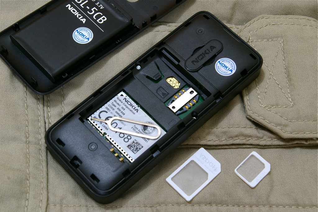
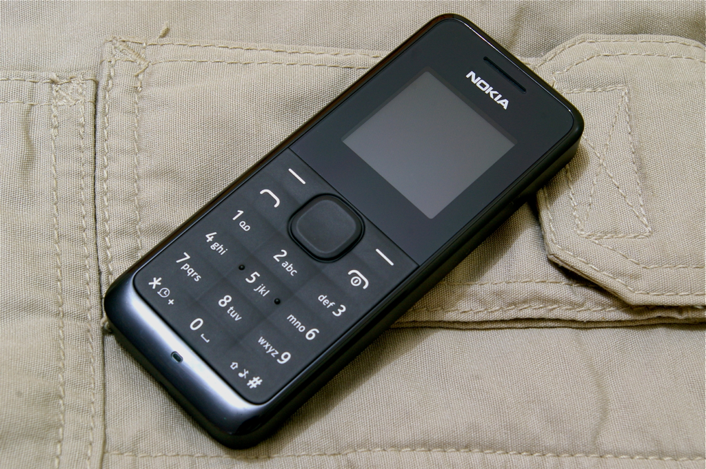
nokia105frontThe Achilles’ heel of smartphones is their battery life. Sure they provide voice calls, SMS, video calls, chat, email, navigation, games, etc. But when your run out of power, it’s no more than a very expensive paperweight. You don’t even get to call or SMS. I’ve sometimes gotten into such situations. Sometimes disaster (in a manner of speaking) is averted by meeting a preset meeting place (that itself is a good practice but that’s another story). But it is definitely a bummer when your phone runs out of juice.

To lengthen their smartphone usage, people resort to battery cases (expensive), carry extra batteries (somewhat expensive and limited to a specific phone model), power banks (less expensive but can get bulky), or chargers (needs somewhere to plug in). Also, more and more public spaces such as malls and cafes are offering charging stations. But then there also the possibility of a prolonged power outage as in a disaster scenario like the recent Yolanda supertyphoon. Of course, cellular signal was also affected but at least the telcos were able to restore some within 3-5 days.

Enter the Nokia 105 with a whooping 35 days of standby. That should be good till the telcos restore service and the US Marines and the Red Cross arrive (never mind the government). It’s probably the perfect smartphone backup. It’s small and light albeit a little chunky due to its relatively big battery. But still, it’s quite handy and fits in some small pocket in your cargos or [bug out] bag.

It’s got the basic Nokia phone functionality we’ve grown up with as well as an FM radio (requires headphones, not included) and flashlight (which unfortunately doesn’t work without a SIM). The keyboard is splash and dust proof but the unit itself is not so you’ll need to wrap it in a Ziploc or something. It’s also relatively inexpensive (lowest I’ve seen so far is P950).

nokia105backTo complete my backup phone kit, I also got a nano SIM to micro SIM to SIM adapter as well as an iPhone SIM extractor tool. And they all store inside the phone. Nifty!

Of course, don’t forget to keep a copy of important numbers either on the SIM or on the phone itself.


iPhone 5s Case

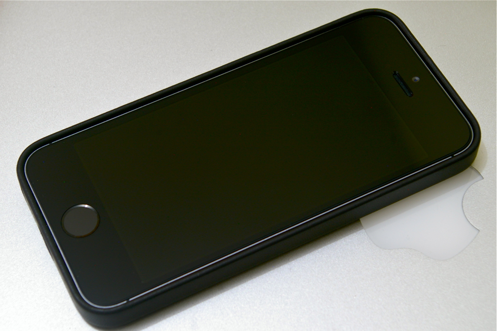
iphone5scasefrontI’ve said that putting the gorgeous iPhone inside a case generally fuglifies it. But there are exceptions such as the Sena UltraSlim Leather Pouch that I used for the iPhone 4/4S. And now there’s the Apple iPhone 5s Case.

Probably one of the things that Apple learned from the antennagate controversy is that bumpers and casings are good business. So along with the recent iPhone 5c and iPhone 5s, they released corresponding casings. The iPhone 5c case looks like Crocs and won’t be mentioned again. Ever.

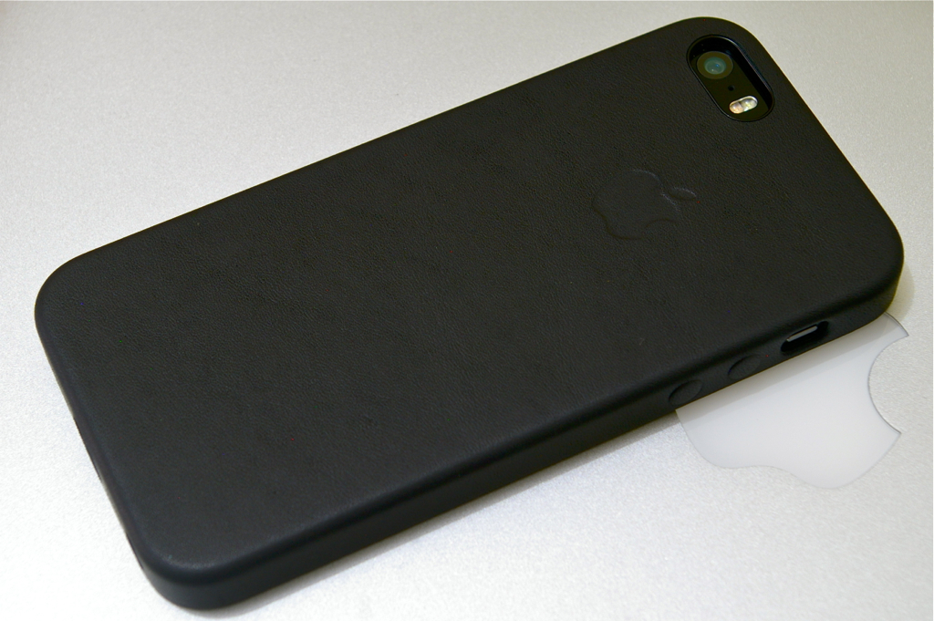
The iPhone 5s case is a full back and side coverage case made of aniline leather reinforced with plastic. The inner side of the back is lined with a soft velvety material to protect the glass and aluminum back of the phone from scratches. That’s three layers but the overall casing is still very slim. The power and volume buttons are covered but remain easy to use. There are precision-cut(!) cutouts and holes for the Lightning port, silent switch, headphone jack, camera, and speakers. The holes for the speakers are especially neat.

iphone5scaseback

The case comes in several conservative (black, brown, tan) and trendy (blue, red, yellow) colors. Supposedly the aniline dyeing process infuses the color deep into the leather and not just on the surface. This means that minor scuffs might not be very visible. Unfortunately, aniline leather is rather fragile and in this case, no pun intended, rather thin. This case is definitely more stylish than protective. But I believe that’s the intent. A premium case for a premium phone. It is a perfect match for the iPhone 5s.