Apple has released iOS 7 beta 3 to developers. Looks like it’s gonna be a 2-week cycle. The most visible change is the system font: thicker and more readable. Most importantly, it’s much more stable now. Haven’t experienced a crash or reboot since installing yesterday. Good going Apple!
Apple has released iOS 7 beta 2. It feels much snappier. But more importantly battery life has vastly improved. Used to last half a day. Now it can last the whole day. Apps are less stable and prone to crash though.
- New Look – the biggest and most discussed change, the “flatter” interface; Skeumorphism is out, simple and modern is in. Reminds me of Android Jelly Bean and Windows Phone 8. Colors are generally flat and simple, icons and text are generally slim and crisp taking full advantage of the Retina display. Generally because the application is not consistent. Looks like the style guide is not yet in place.
- Notification Center – updated with today, all notifications, and missed notifications. And no, the today view is not something Google Now innovated :P Still no swipe to dismiss.
- Control Center – a pull up tab with quick access to system settings for Airplane Mode, WiFi, Bluetooth, Do Not Disturb Mode, Orientation Lock, and brightness. It also has the media player controls and shortcuts for some apps (flashlight, clock, calculator, and camera).
- Folders – animated unless it’s on the dock. Also folder now have multiple pages just like the home screen.
- Multitasking – improved process list with screen preview of process. You can swipe up on the previews to close apps. Supposedly, apps can actually run on the background when the phone is awake.
- Settings – fugly icon, new interface that reminds me of Android Jelly Bean
- Safari – fugly icon, new interface, smart address/search bar, tabs no longer limited to 8. You can swipe left to close tabs.
- Camera – new interface, swipe left and right to choose between video, camera, square (think Instagram complete with filters), and panorama.
- Photos – new interface, new filing system (years, collections, moments)
- Siri – enhanced capabilities such as adjusting system settings and new data sources
- Flickr and Vimeo Intgration – similar to Twitter and Facebook integration.
Overall, I like where iOS is heading. But this beta is the roughest (and most sluggish) one I’ve ever tried. That’s not a good sign.
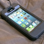
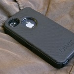
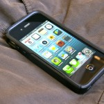
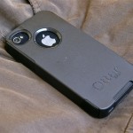
After a few months of use, my knock-off OtterBox Commuter chipped and cracked so I looked for replacement case. Over the holidays, Edong accompanied me in the search. It was tough going because every shop were carrying mostly iPhone 5 cases. We did find a knock-off OtterBox Commuter at the place where he got his own case. But it was P650 and it wasn’t even well-made. Today, I dropped by the phone accessories section of a nearby mall and ended up at the stall of this Chinese guy at the far end of the section. He showed me not just a Commuter (P250) but also a Defender (P700). They were good copies. Definitely better than my old one. The Commuter even had stiffer silicone similar to the one being used by OtterBox. I asked for his last price and he said P200 for the former and P600 for the latter. I asked him if I can get both for P750 and after some thought he agreed. But I’m sure he still got a tidy profit. In fact, the other stall keepers were actually getting stocks from him while we were transacting.
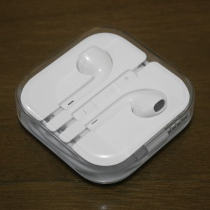 Grabbed a pair of EarPods yesterday. They were out of stock in quite a few stores but I finally got lucky.
The EarPods come in a case that acts as a cable wrap and is really pretty and, more importantly, functional. The earphones themselves are just as beautiful. It’s got a curvy organic look. Supposedly it was designed for the human ear. They’re not in-ear headphones but they are shaped in such a way as to deliver the sound directly into the ear canal.
The sound is definitely better compared to the old Apple earphones. The sound is not as tinny as before. Definitely there was an improvement in the mid and low range. The bass is definitely not the thumping, at least in the ear, kind of way but I guess they also had to consider voice.
I’m quite pleased with them. Too bad, because now that I have them, there’s one less reason for getting an iPhone 5 :P
