The iPhone 16 is here, and while it doesn’t carry the SE name, it follows the same playbook that made the SE lineup such a fan favorite: flagship-level performance wrapped in a familiar, no-frills design.
Read MoreWant to add MagSafe to your old or non-MagSafe phone? In this video, I’ll show you two easy ways to do it, using a MagSafe case and using a MagSafe ring. Let’s get started!
 iPhones don’t exactly have the best battery life. With normal use, they last me about a day. But with heavy use, which is often, I’d be lucky if they last till the evening. So I considered either a battery case or a power bank to address this limitation. Once, I spotted a Mophie Juice Pack but due to budget considerations I didn’t get it. When I finally decided to, I couldn’t find one anymore. So I settled for a power bank which does work but can sometimes a bit unwieldy and often get left behind. Then last Friday, I was looking at OtterBox cases when I saw the Resurgence. Being an avid OtterBox fan, I immediately got it.
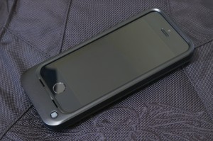
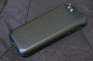
The Resurgence is composed of two pieces. The front piece covers the sides and wraps around the edges giving the screen a slightly raised protective bezel. This protects the screen from direct contact when the phone is face down. The buttons have touch-through covers that are easy to press. Unfortunately, they are a bit loose and rattle when your shake the case. There are ports for the speakers that channel sound to the front. Finally, there are cutouts for the silent switch and the charging button on the back piece. The silent switch is still easily accessible with a finger.
 The back piece is a big chunk that holds the battery. There are cutouts for the camera, flash, and silent switch. At the bottom portion, it has an internal Lightning plug, a micro USB port, a through-port for headphones, and the charging button which also acts as a battery level and charging indicator. It is coated with a black smooth material which seems less rubbery and more durable than similar coatings.
To install, you slide the phone inside the back piece and into the Lightning plug. Then you snap the front piece over the phone. The case comes with just a bit of charge from the factory so the first step is to charge using the included micro USB cable. Once charged, you press the charging button to see the battery level. There are four lights arranged around the button which shows the charge level in 25% increments. To charge, you press and hold the button for 3 seconds. To stop charging, you do the same thing.
The whole case fits the iPhone snugly and in fact it is very difficult to remove the phone. It looks quite rugged and could bounce off the floor. In fact, it is military-rated for drop protection (MIL STD 810G-516.6; Do note the Applicability to “ruggedized” consumer products section). So for a rugged battery case, I think it’s pretty good. I like it better than the Mophie Juice Pack though I’m not sure if it’s as rugged as the Mophie Juice Pack Pro.
Now for the bad stuff. The battery, although advertised to give you 2x (as in phone lasts twice as long), so far only get me (starting from below than 10%) to just around 70-80%. Quite frankly, that sucks. I’m hoping a few cycles will result in improvements. Another problem is that the charging button seems to be prone to cracking. Finally, there are quite a few molding imperfections on the casing. They’re small but they’re there. All these is unfortunate as OtterBox has, in the past, been known for quality. It seems the stiff competition is forcing it to cut corners. That’s bad news for both OtterBox and us.
Rating: 3/5
As widely expected, Apple announce the iPhone 6 at their September 9 event. Actually two iPhones. Specifications-wise, they’re actually average. So they’re quite disappointing to some (and always disappointing to Android fans). The features are pretty much normal for other (read: Android) phones. It doesn’t even have QHD (1440×2560) which some Android flagship phones like the LG G3 already have.
But Apple doesn’t usually go for bleeding edge technology for the sake of it. Why go beyond overboard with the pixels per inch (ppi) when you can make just the same (or actually much much more) revenue for less cost (of high-resolution displays). You probably can’t even tell the difference (I know I can’t) when holding the phone at normal usage distance.
Why use new technologies when they’re still unstable and potentially ruin the all-important user experience? Why offer 802.11ac when most installed routers and access points don’t support it? Why offer NFC when there’s no business case and corresponding strategy for it? But now they have Apple Pay, which was announced on the event.
But people are asking for bigger phones because of more media consumption (to quote a friend) and so they delivered a big phone and a bigger phone.
I do hope they will offer a smaller version for us who still like our things small and beautiful. Unfortunately, other than the display size and the NFC, the iPhone 6 and 6 plus are more incremental improvements. So for now the iPhone 5s neatly fills in the slot for a small phone in the product range. That may show up on next year’s iPhone 6 upgrade or in two years on the iPhone 7 range.
But the big thing during the event was the now classic “one more thing”: the Apple Watch. It’s actually more of a fitness/health monitor with extra functionality which just happens to include telling time. Or you can also say it’s a watch because it watches your fitness/health :P In terms of the target market, it’s quite clear from the photos and videos they used: it is for the fashionable millennial fitness buff. And boy did they nail it!
The Apple Watch offers two case sizes (women’s and men’s), three case materials (stainless steel, aluminum, and gold) and a whole bunch of straps. Strap it on for the gym (or the route) along with the rest of your trendy gym wear, look fab doing your sets, and then go off to work and/or the coffee shop. If you’re still wearing your Apple Watch by then, even better. For Apple. Of course that would depend on the battery life on which Apple was silent. But if it’s better than the generally dismal battery life of most other, if not all, smartwatches, then Apple has a winner.
Most have known, or at least suspected that Apple is not just a hardware company, is not just a software company, but a lifestyle company. If you’re not convinced look at the iPod, the iPhone, U2, the iTunes festival, Beats, and now the Apple Watch which further reinforces that identity.
So a word of advice to Samsung and company: you’re not competing against a phone, you’re competing against a lifestyle. Good luck!