OtterBox Commuter for iPhone 4/4S (Class A)

The Otterbox Commuter is a mid-level risk case slotting between a bumper and a heavy-duty case like the Otterbox Defender. Unfortunately, they’re rather expensive at P2,100 or thereabouts at local shops. And then I saw Edong’s Class A OtterBox Commuter case for his Samsung Galaxy S-III. “Class A” is a euphemism for knock-off so it was way cheaper. I was impressed with the quality (for the price) so I got one for my own phone.

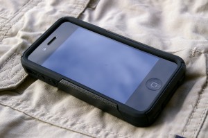
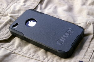
Just like its “inspiration”, the case is composed of two pieces: a silicone inner layer and a polycarbonate outer layer. The silicon layer covers the back and wraps around the edges giving the screen a slightly raised protective rubber bezel. This protects the screen from direct contact when the phone is face down. The buttons have touch-through covers but are still reasonably easy to press. The proprietary Apple USB port is covered by a flap and should be easily accessible to most accessories. There are cutouts for the camera, flash, and silent switch. The silent switch is still easily accessible with a finger.

The polycarbonate layer clips onto and around the silicone layer giving it another layer of protection. The whole case fits the iPhone snugly and makes it look like it could bounce off the floor. I’m just concerned about the the durability of the polycarbonate considering this is just a “Class A”. But at P300 (and could be lower) a pop, it should be less painful to replace.


Casio G-Shock GW2310FB-1CR

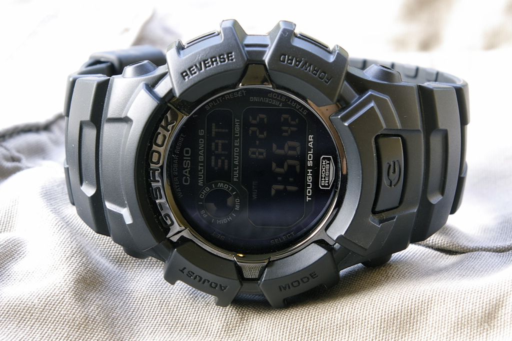
Leslie finally came back from his onshore assignment and he dropped this off at my desk: My new Casio G-Shock GW2310FB-1CR. Casio G-Shocks are known for their resistance to shocks (e.g. hard knocks and strong vibrations). They are designed primarily for sports, military, and outdoor adventure oriented activity. Of course, they’re also water-resistant to 200M. Operators may have Rolexes and Omegas but when they’re actually operating, they wear G-Shocks. And the color of this particular model, all black, backs up the walk with the look.

Aside from being a helluva beater of a watch, it’s also a gadgety watch. Consider the specs:

  • Tough Solar Power – Solar rechargeable battery with power saving function and battery power indicator
  • Battery life – 10 months on full charge an no further exposure to light
  • Multi-Band Atomic Timekeeping (US, UK, Germany, Japan, China) – Receives time calibration radio signals which keep the displayed time accurate, accuracy: +/- 15 seconds per month
  • EL Backlight – With auto (glance to light) and manual (press G button to light) Illuminate and afterglow (1 or 3 seconds).
  • World Time – 31 times zones (48 cities + UTC), city code display, daylight saving on/off
  • 4 Daily alarms and 1 Snooze Alarm
  • Hourly chime
  • 1/100 second stopwatch – Elapsed time up to 24 hours, split time, 1st-2nd place times
  • Countdown Timer – 1 minute to 24 hours
  • Full auto-calendar (pre-programmed until the year 2099)
  • 12/24 hour formats
  • Button operation tone on/off

Unfortunately, it doesn’t have the compass, altimeter/barometer and thermometer function of the recently departed Suunto Observer. Also, this particular inverted display is a bit hard to read especially since the numbers are smaller than those on the Observer. Finally, the backlight doesn’t remain on while being operated but shuts down in 1 or 3 seconds, depending on the setting. On those, Suunto had it beat. But at $150, it’s still a lot of bang for the buck.

Rating: 4/5

Google Nexus 7

Google has announced their much-anticipated own brand tablet. At $199 it competes squarely against the older Samsung Galaxy Tab 2 7.0 and Amazon Kindle Fire. More importantly it moves closer towards the high-value price points set by the iPad. Way to go, Google!

Samsung Galaxy Tab 2 7.0 Amazon Kindle Fire Google Nexus 7
Size 193.7 x 122.4 x 10.5 mm 190 x 120 x 11.4 mm 198.5 x 120 x 10.5 mm
Weight 344 g 413 g 340 g
Display PLS LCD capacitive touchscreen, 16M colors IPS TFT capacitive touchscreen, 16M colors LED-backlit IPS LCD capacitive touchscreen, 16M colors
1024 x 600 pixels. 7 inches 1024 x 600 pixels, 7.0 inches 1280 x 800 pixels, 7.0 inches
Processor Dual-core 1 GHz CPU, PowerVR SGX540 GPU, TI OMAP 4430 chipset Dual-core 1 GHz Cortex-A9 CPU, PowerVR SGX540 GPU, TI OMAP 4430 chipset Quad-core 1.3 GHz processor, 12-core ULP GeForce GPU, Nvidia Tegra 3 chipset
RAM 1 GB RAM 512 MB RAM 1 GB RAM
Internal Storage 8/16/32 GB storage 8 GB storage 8/16 GB storage
External Storage Up to 64GB No External Memory No External Memory
Data Wi-Fi 802.11 a/b/g/n Wi-Fi 802.11 b/g/n Wi-Fi 802.11 a/b/g/n
Operating System Android OS, v4.0.3 (Ice Cream Sandwich) Amazon-customized Android OS, v2.3 (Gingerbread) Android OS, v4.1 (Jelly Bean)
Primary Camera 3.15 MP none 1.2 MP
Secondary Camera VGA none none
Video 1080p at 30fps none 720p at 30fps
Apps Android Market + access to non-market apps Amazon AppStore Android Market + access to non-market apps
Battery Standard battery, Li-Ion 4000 mAh Standard battery, Li-Ion 4400 mAh Standard battery, Li-Ion 4325 mAh
Battery Life 8h 8h 8h

Surface Surfaces

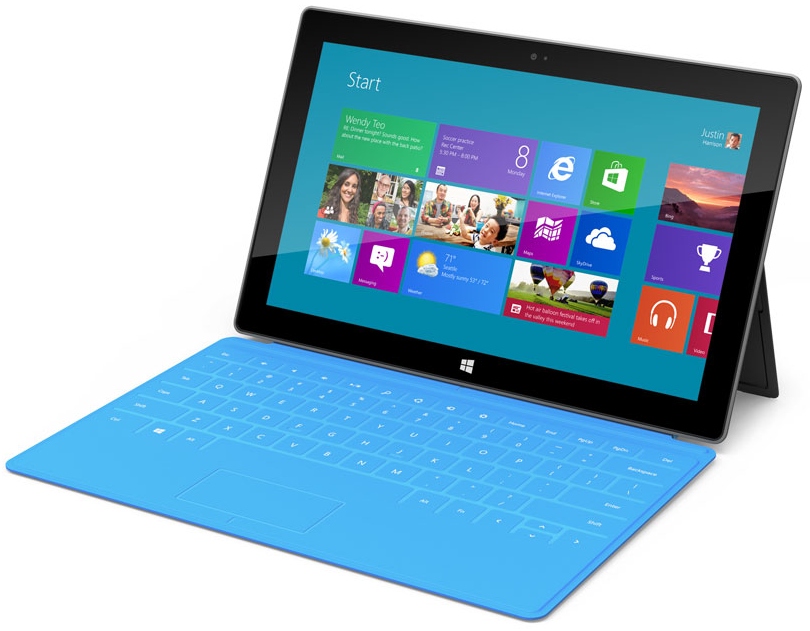
The table is now a tablet. Microsoft has announced it’s own branded tablet (ahead of the anticipated Google’s own branded tablet). And guess what? It looks like and iPad down to the screen cover. If it wasn’t for the Windows logo and the keyboard, I could swear it’s an iPad. And then the microsite looks so minimalist, so Apple-ish. Looks like Apple has another company to sue.

iOS 6 beta

So iOS 6 was announced at WWDC and I grabbed the beta soon as it became available. It generally looks just like iOS 5 in keeping with Apple’s incremental improvement approach. There were changes here and there but the biggest ones I noticed were:

  1. Maps – out goes Google and in comes TomTom, their new maps data provider. New features are turn-by-turn navigation and 3D view. Level of detail is less than Google Maps at this time though.
  2. Passbook – one place for all your electronic/digital passes, tickets, discount cards, coupons, etc.
  3. Siri – gets new functionality such as launching apps.
  4. Call Handling – Do not disturb mode (with exceptions to selected number or repeated calls, how cool is that?), send SMS to reject call (Nokias had this since like forever), callback reminder.
  5. Parental Control – better restrictions on apps and content, Guided Access mode (stay within one app). Just be sure your toddler doesn’t slam your iDevice on the floor in frustration.
  6. Privacy – better privacy control
  7. Mail – Mailbox management (VIP and flagging), add attachments from the new message screen, new pull down to refresh animation.
  8. Clock – Alarm sound can be a song. You can wake up to the sound of Manic Monday and Friday I’m In Love :P
  9. Safari – offline reading, syncing
  10. Share Button – graphical, colorful, and prettier. Way better than the previous text list.
  11. Built-In Apps – built-in apps such as iTunes and Music have sleeker, easier-to-use interfaces. Unfortunately, Find My Friends isn’t one of them. Not that anybody uses it.
  12. New Wallpapers – 3 new wallpapers including the official iOS 6 ripples background.
  13. Facebook Integration – Similar to the Twitter integration introduced in iOS 5. Couldn’t care less about this :P