Apple has released iOS 7 beta 2. It feels much snappier. But more importantly battery life has vastly improved. Used to last half a day. Now it can last the whole day. Apps are less stable and prone to crash though.
- New Look – the biggest and most discussed change, the “flatter” interface; Skeumorphism is out, simple and modern is in. Reminds me of Android Jelly Bean and Windows Phone 8. Colors are generally flat and simple, icons and text are generally slim and crisp taking full advantage of the Retina display. Generally because the application is not consistent. Looks like the style guide is not yet in place.
- Notification Center – updated with today, all notifications, and missed notifications. And no, the today view is not something Google Now innovated :P Still no swipe to dismiss.
- Control Center – a pull up tab with quick access to system settings for Airplane Mode, WiFi, Bluetooth, Do Not Disturb Mode, Orientation Lock, and brightness. It also has the media player controls and shortcuts for some apps (flashlight, clock, calculator, and camera).
- Folders – animated unless it’s on the dock. Also folder now have multiple pages just like the home screen.
- Multitasking – improved process list with screen preview of process. You can swipe up on the previews to close apps. Supposedly, apps can actually run on the background when the phone is awake.
- Settings – fugly icon, new interface that reminds me of Android Jelly Bean
- Safari – fugly icon, new interface, smart address/search bar, tabs no longer limited to 8. You can swipe left to close tabs.
- Camera – new interface, swipe left and right to choose between video, camera, square (think Instagram complete with filters), and panorama.
- Photos – new interface, new filing system (years, collections, moments)
- Siri – enhanced capabilities such as adjusting system settings and new data sources
- Flickr and Vimeo Intgration – similar to Twitter and Facebook integration.
Overall, I like where iOS is heading. But this beta is the roughest (and most sluggish) one I’ve ever tried. That’s not a good sign.
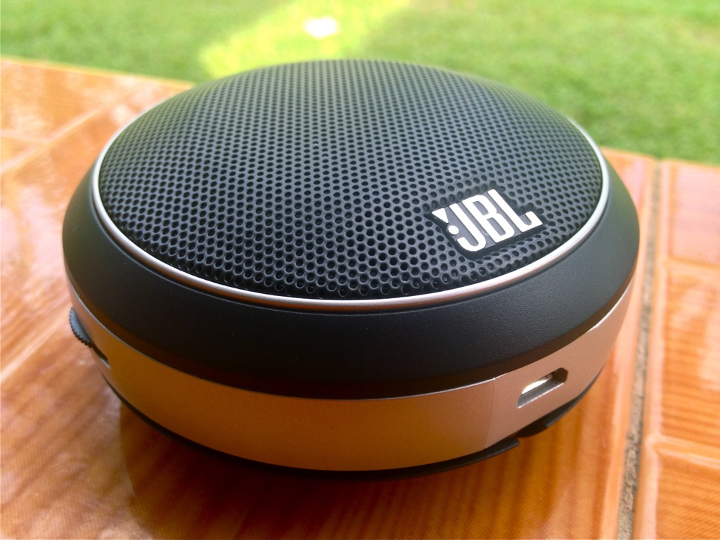
In preparation for the Hundred Island trip, I got a JBL Micro Wireless mobile speaker. It’s a small UFO-shaped speaker. The speaker grille is black and body is silver which makes it, from an aesthetic perspective, compatible with most mobile devices. It looks great whether beside my MacBook Pro, my black iPhone 4S, or even Jeanne’s iPad mini rugged OtterBox armor and all. Under the speaker grille is a status LED which glows blue when powered on, blinks blue during pairing, and glows red when low on power.
Along the silver body you will find a power/Bluetooth pairing button, volume dial, a micro USB port, and a 3.5mm audio output port. A short cable for a 3.5mm plug is discreetly wrapped around the body and the 3.5mm plug itself is nestled in cutouts at the bottom. Very elegant as you can see in the photo.
The 128GB iPad is now available on the Apple Store. And don’t you say “640K 64GB ought to be enough for anybody.” In any case, that’s not what I want to talk about.
Much has been said about the 128GB iPad but what’s interesting is Apple’s pricing. Every additional $100 get you twice as much memory as the previous model.
This pricing applies not just to iPads but also iPhone and iPods. Some would say you pay more for less with Apple products. But if we just look at the pricing between the models, you pay less for more. Is that good pricing strategy? Yes, it is!
Around two weeks ago, the display of the TV started becoming washed out and eventually became negative. I did some research and learned it could be the expensive inverter board. I called Samsung service and they scheduled a visit. They diagnosed the problem as the timing control (TCON) board. That was a huge relief to me. But the board still had to be ordered so they scheduled another visit. Today, the technician arrived with a new board and quickly installed it. Voila, TV fixed. And Jeanne was glad she finally got her big screen back and not settling on the 7.9″ iPad mini. Sometimes bigger is better.

