PSMonitor 1.6 is out! It now has iOS 7 look and feel. There are also some minor enhancements and minor bug fixes. Do check it out!
 I wanted to unlock the iPhone 4S so that I can be more flexible in carrier selection. My first, and preferred, option was for the carrier to unlock it. AT&T, for example, does that for out-of-contract phones. The IMEI of the phone is actually officially registered with Apple as unlocked essentially making it factory unlocked. Unfortunately, the local carriers do not unlock phones whether it is still in-contract or out of it.
My next option was unlocking using software. This means installing 3rd party tools that Apple does not approve of. Thus jailbreaking is required. Unfortunately, the phone is already on the latest iOS version and as of this writing, there is no jailbreak available. Nor is downgrading to an older iOS version possible unless I have SHSH blobs which I don’t.
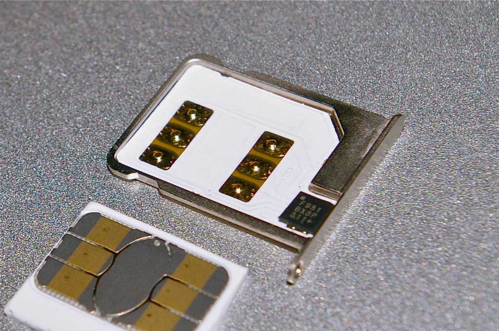
My last option is an interposer SIM. It is essentially a pseudo-SIM that interposes itself between the new SIM and the phone. It’s a marvel of miniaturization. They basically fit in the new SIM, an adapter, and a microprocessor within a SIM tray. Once inserted, you simply “program” the interposer SIM to emulate the old SIM. You actually just input the IMSI of the carrier.
The best-known interposer SIM is the Gevey. I actually wasn’t able to get a Gevey, but instead was given an X-SIM. But it works the same way. And yes, it does work!
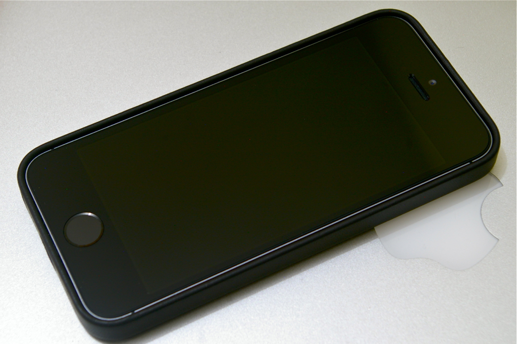 I’ve said that putting the gorgeous iPhone inside a case generally fuglifies it. But there are exceptions such as the Sena UltraSlim Leather Pouch that I used for the iPhone 4/4S. And now there’s the Apple iPhone 5s Case.
Probably one of the things that Apple learned from the antennagate controversy is that bumpers and casings are good business. So along with the recent iPhone 5c and iPhone 5s, they released corresponding casings. The iPhone 5c case looks like Crocs and won’t be mentioned again. Ever.
The iPhone 5s case is a full back and side coverage case made of aniline leather reinforced with plastic. The inner side of the back is lined with a soft velvety material to protect the glass and aluminum back of the phone from scratches. That’s three layers but the overall casing is still very slim. The power and volume buttons are covered but remain easy to use. There are precision-cut(!) cutouts and holes for the Lightning port, silent switch, headphone jack, camera, and speakers. The holes for the speakers are especially neat.
The case comes in several conservative (black, brown, tan) and trendy (blue, red, yellow) colors. Supposedly the aniline dyeing process infuses the color deep into the leather and not just on the surface. This means that minor scuffs might not be very visible. Unfortunately, aniline leather is rather fragile and in this case, no pun intended, rather thin. This case is definitely more stylish than protective. But I believe that’s the intent. A premium case for a premium phone. It is a perfect match for the iPhone 5s.
After fixing my car emergency kit, I moved on to my first aid kit.
- Scissors
- Tweezers
- 12 strips Band-Aid
- 1 roll cloth tape
- 4 gauze pads 3×3
- 2 gauze pads 4×4
- 2 feminine napkins – not just for feminine emergencies but also for staunching wounds
- 1 pack cotton buds
- 1 pack cotton balls
- 1 bottle Betadyne
- 1 tube Bactroban (Mupirocin)
- 8 tablets Allerta (Cetirizine) – antihistamine/anti-allergy
- 8 tablets Diatabs (Loperamide) – anti-diarrhea
- 8 tablets Biogesic (Paracetamol) – analgesic/pain reliever
- 8 tablets Neozep – decongestant
Maybe I’ll throw in a tourniquet, surgical blades, and a suturing kit someday after some training. Anything else I should add?
Today, Manny Pacquiao fights Brandon Rios. It will be a national event as usual. But for the first time, I’m hoping that Pacquiao will win. I have a few reasons:
- After a triple whammy of terrorism (yes, terrorism) in Zamboanga, earthquake in Bohol, and supertyphoon Haiyan/Yolanda, the country needs inspiration. Of course, the huge outpouring of aid from both inside and outside the country is already one of the most inspiring things I’ve seen (many thanks!).
- Some people in the Rios camp are a$$holes and jerks.
- Pacquiao needs a win. He hasn’t won his last few fights. But even if he had, if only to end his boxing career at a high note. I think he should hang up those gloves after this and forget about Marquez and Mayweather. But I doubt he will just yet.
UPDATE: Pacquiao won! Hooray!
